zohaib a.
(zo-hey-b)
z@heyzohaib.com
Client

GuideBuddy

Project Type

Web Application

Role / Services

UX, Visual Design & Branding

Outline

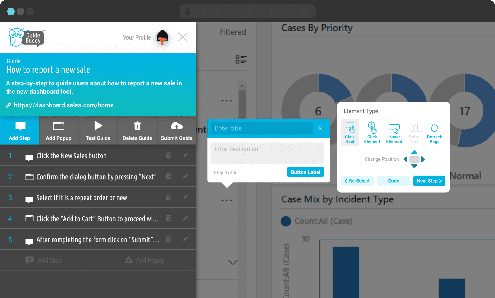
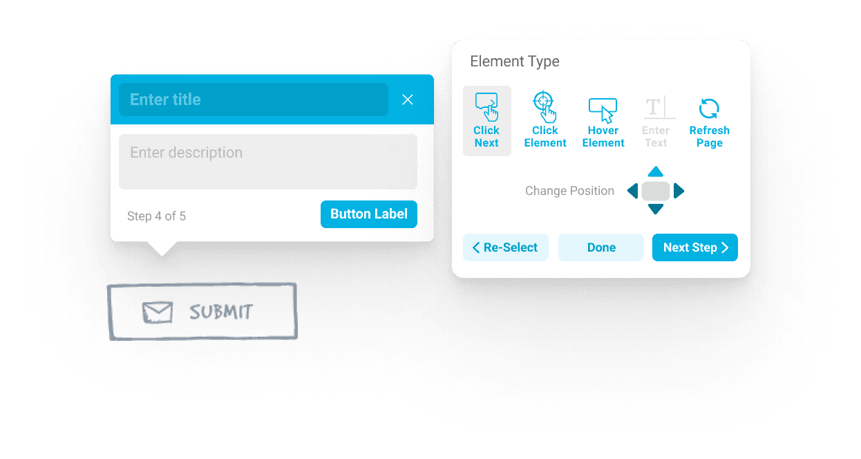
Designing a  no-code live guidance platform to build step by step walkthroughs for onboarding and application training.
The Challenge

Change is hard.

GuideBuddy’s primary aim was to replace or offer an alternative to the common practise of reading help articles or watching videos to learn to use a web application.

While end users preferred to receive the training using live guidance while using an application. However, for someone creating these guides, the process had to be easier than writing an article, guiding someone on a phone call or writing an email explaining the process, so they could use the application more frequently to create guides.

GUIDE DISCOVERY

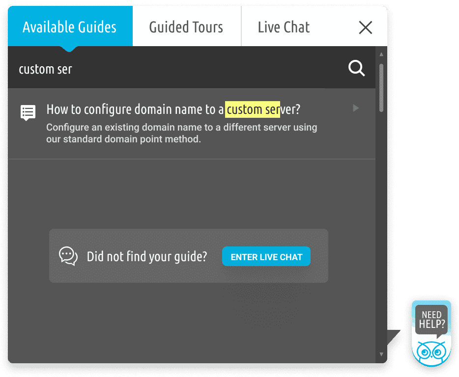
A multi-functional widget designed to discover and start guides

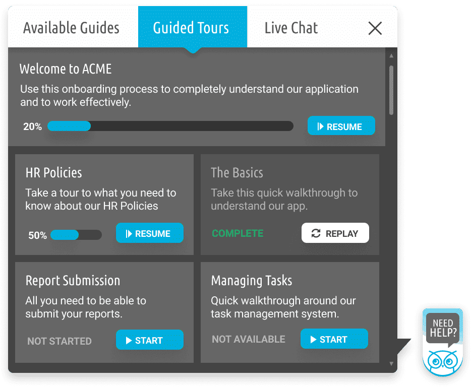
Guided Tours

The onboarding features allow for multiple guides to be grouped together in a sequence. Progress is also tracked marking the sections as completed to be continued or revisited later.

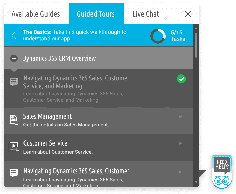
When inside such a section, a combination of guides, articles or videos can be used to accommodate the application onboarding or feature training process.

Available Guides

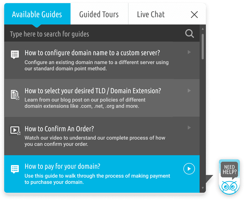
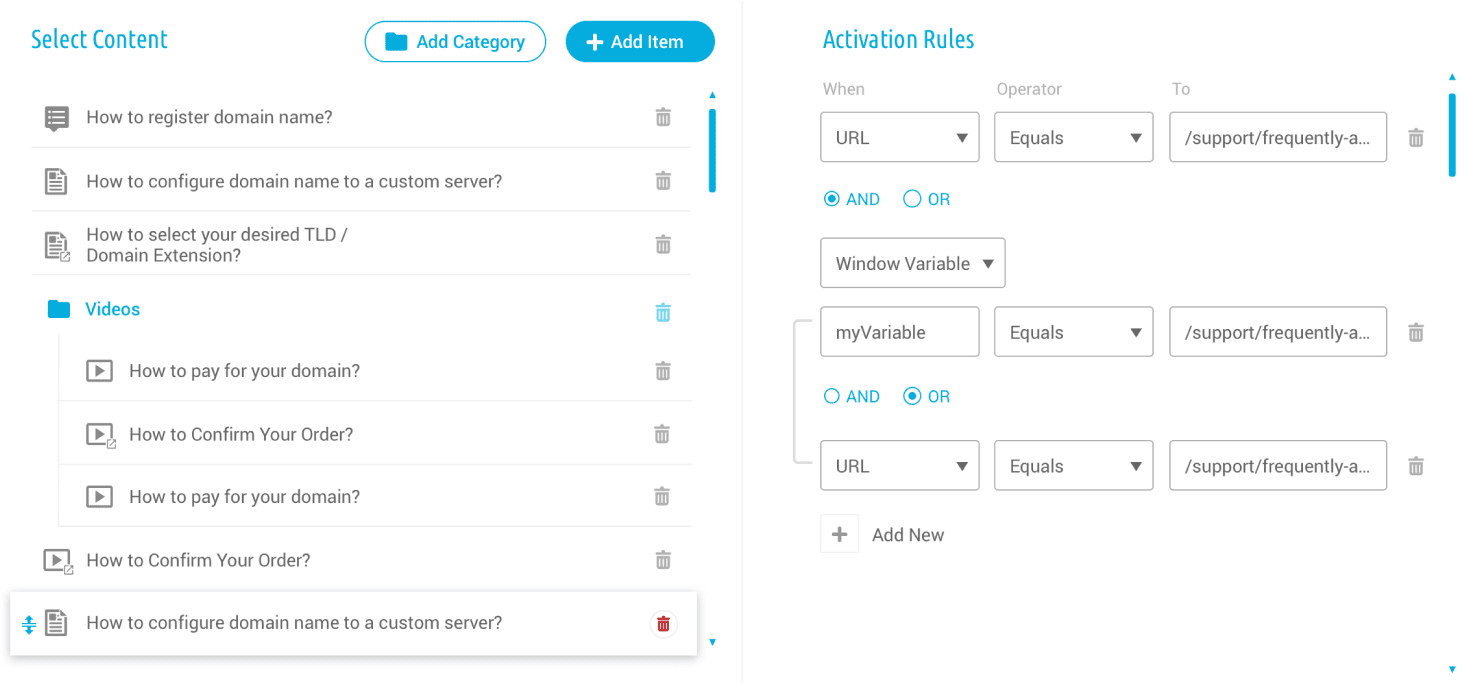
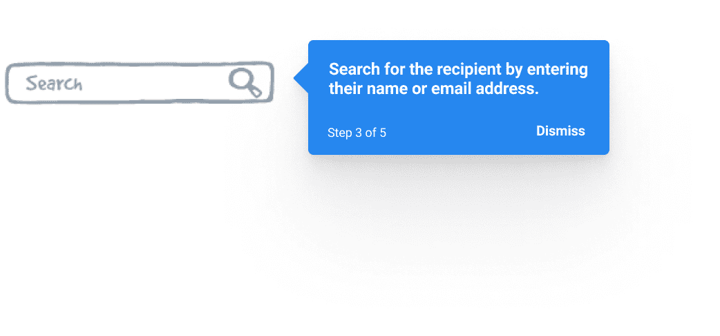
Instead of defaulting to live chat or knowledgebase articles, users can trigger the GuideBuddy widget to get step-by-step guides. The list of available guides can be contextual through segmentation settings, including where they are on the website/application.

With the search feature, users also get a quick shortcut to start a live chat if they are unable to find their guide.

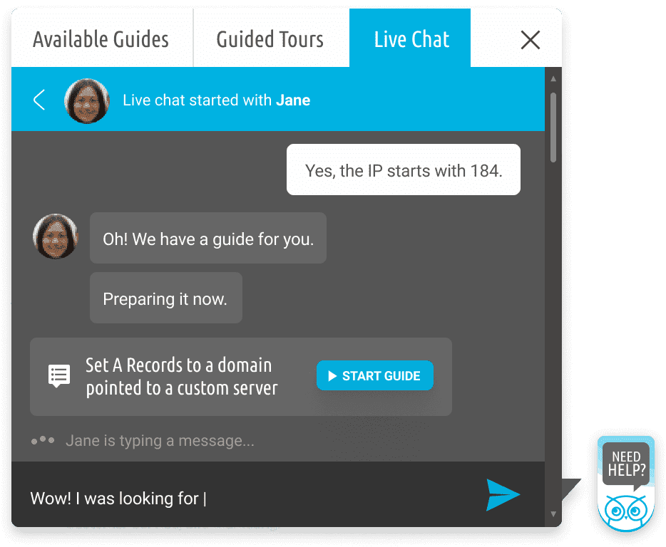
Live Chat

Instead of live chat agents pointing users to where to find the information they are looking for, which often involves mentioning the name and location of a button, the support agents can save both their time and the customers’ by linking a guide which a user can start to perform their tasks independently.

The Problem

Speed

A proof of concept to test feasibility for development had already been created. The team was excited to move further and I was added to the team as the only designer to design the UI of the  already built application as a 3-month freelance agreement.

Setting up processes

One step back,
many steps forward

Trying to catch up with the development speed was creating inconsistencies with the design and the user experience was suffering because of lack of research and testing.

I was able to convince the team to allow design to take a step back and view the product from a bird's eye view and strategize accordingly. This included from going deeper into the target audience with user personas to the overall product vision. From a screen-to-screen design approach originally anticipated by team, it went to a holistic view of the application where experience mattered more than the number of screens.

Extending the design system

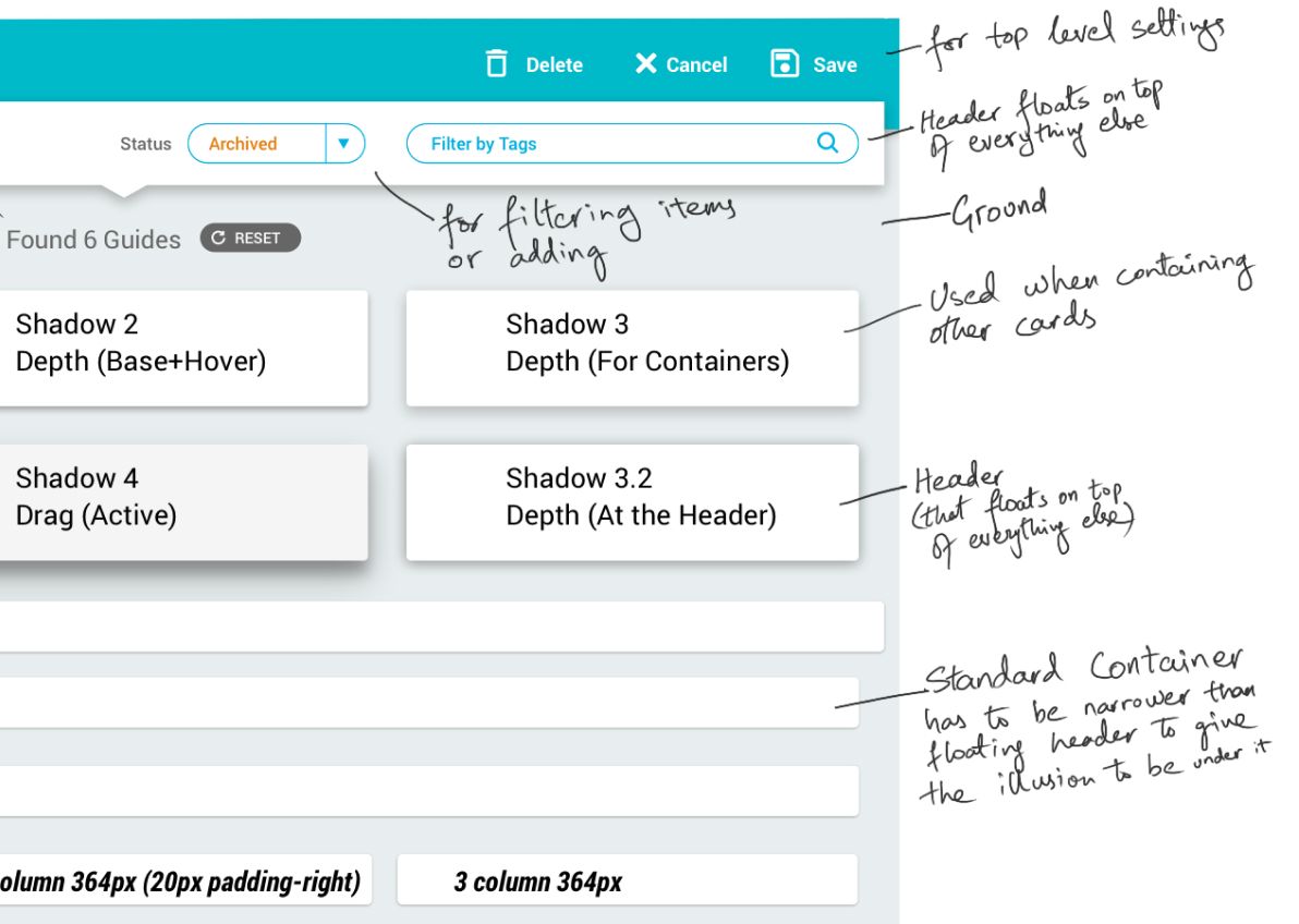
Creating a Depth Hierarchy

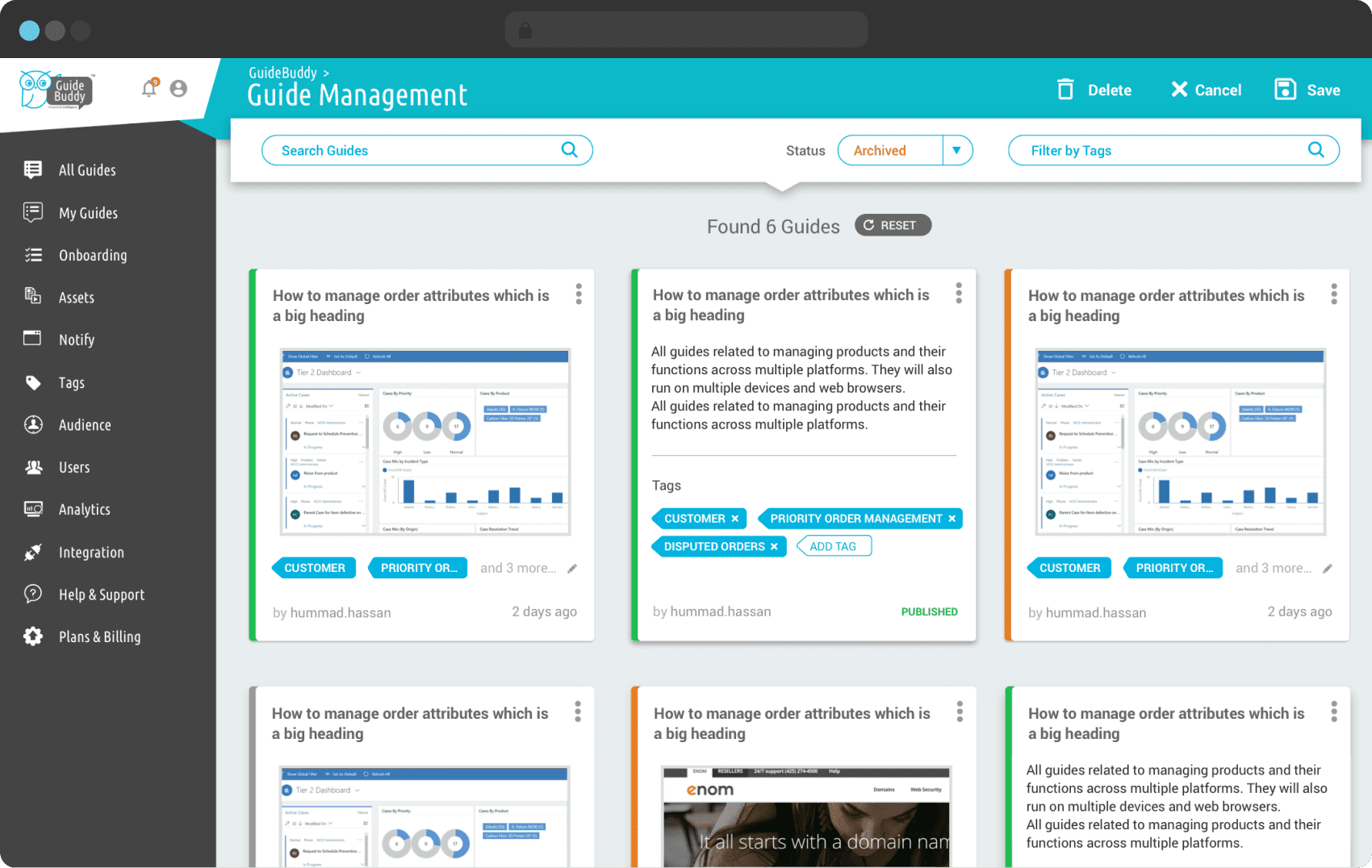
Adding more controls to the header harder to navigate and inconsistent that started with a single row. With a different set of controls on each page and not enough room to add labels, we started adding tooltips as possible solutions but it was only a workaround. We needed a change.

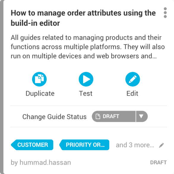
After various iterations, we agreed to divide the header into two levels. The top bar to only have top level settings, normally reserved for actions needed to be used only once per interaction. A new floating bar was added to filter or add items that would directly reflect to what was displayed below.

This required a depth hierarchy to be made a part of the design system. It was inspired by Google’s Material Design to make the floating appear above the other layers.

The Problem Solution

Speed

With the design system in place, it became easy to focus on user experience, and for the developers to also not have to rethink design implementation every time a new layout was created.

Designers like Zohaib are a rare find. Over the years of working even with senior designers from North America, I have never met someone with such a deep understanding of UX and product design. Zohaib is very easy to work with and he adds value not just for design but across the spectrum, from design to strategy, content and marketing. During our product demos and investor presentations, I received a lot of positive feedback because of the design alone because of him.
Picture of the author of the testimonial
—Murad Kayani
Co-founder and CEO,
Zeurix and GuideBuddy
Leesburg VA, USA

Are you looking for a senior designer who you can rely on to design a visually stunning and good to use website or app for your business?

To have a quick chat about your project or job post immediately:

Text me at +1 (415) 523 5884 or
DM me on Twitter @HeyZohaib

you can also

Email me at z@heyzohaib.com or
Schedule a discovery call.