zohaib a.
(zo-hey-b)
z@heyzohaib.com
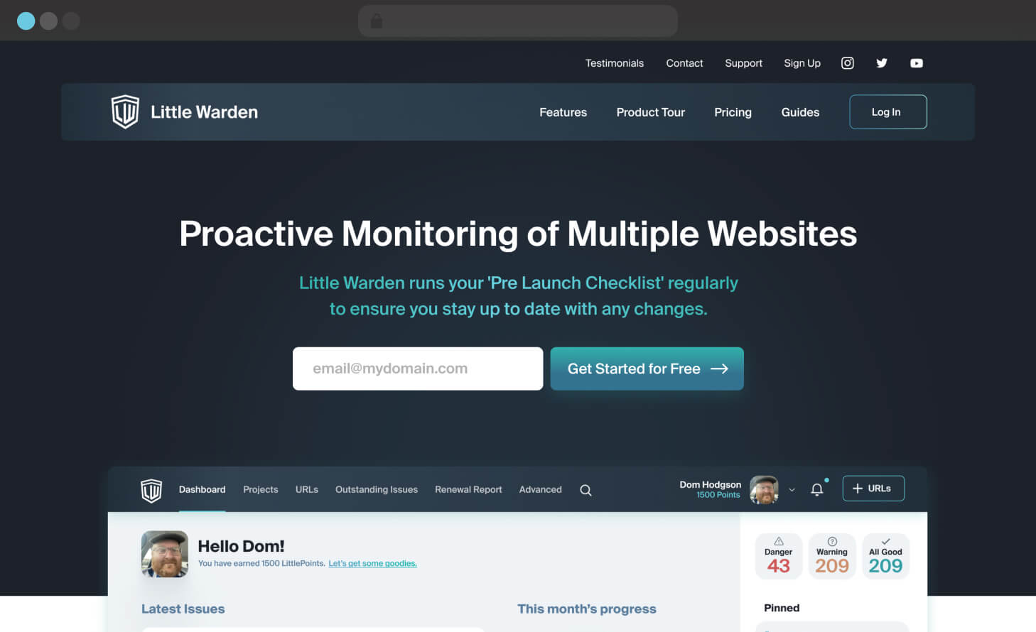
Little warden website home cover
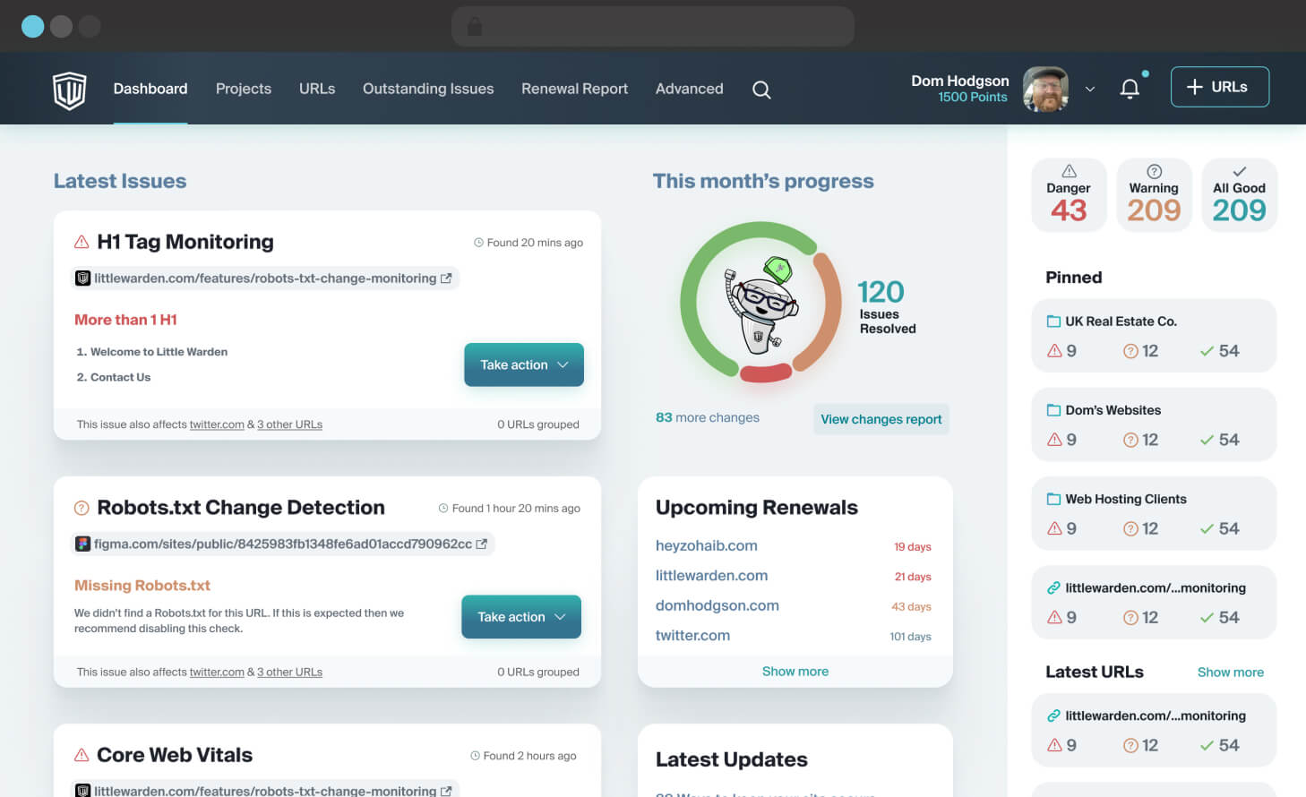
little warden application home cover
Client

Little Warden

Project Type

Web Application & Web Site Design

Role / Services

UX & Visual Design

Project

Designing the marketing website and application for a service to monitor multiple websites based on various checks.
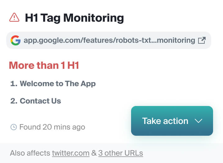
Designing a fun experience for boring stuff popup
The Challenge

Designing a fun experience for boring stuff.

The existing design became dated, both visually and experience-wise, especially as new features have been added over time.

The process was long and users were using a fraction of the available features. This had to be tackled through design to encourage the users to perform tasks in the app.

There was also a need to improve the onboarding process for new users without confusing seasoned users with a completely different experience.
Designing a fun experience for boring stuff
Designing a fun experience for boring stuff popup

Solution to dated design and increasing conversions

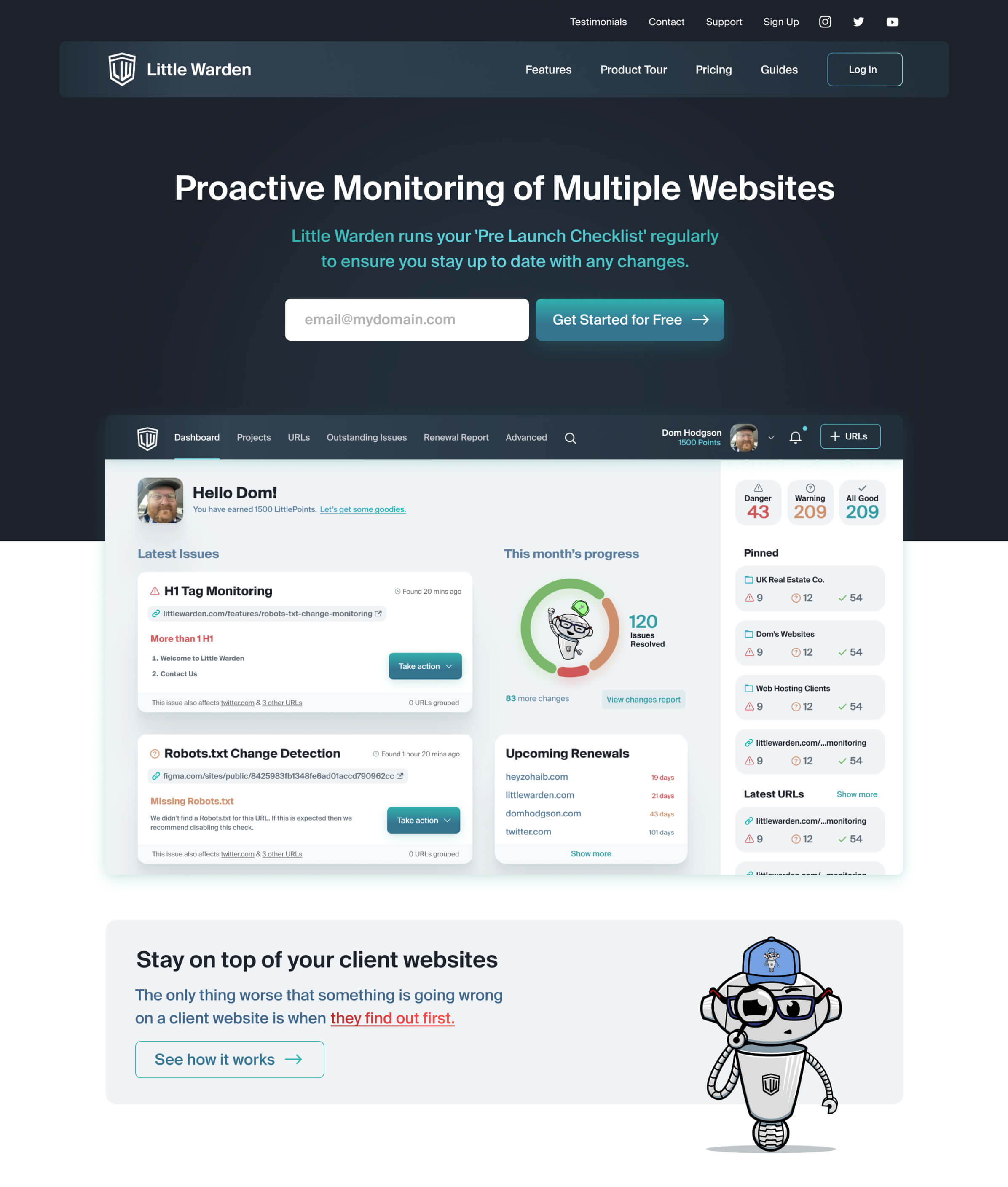
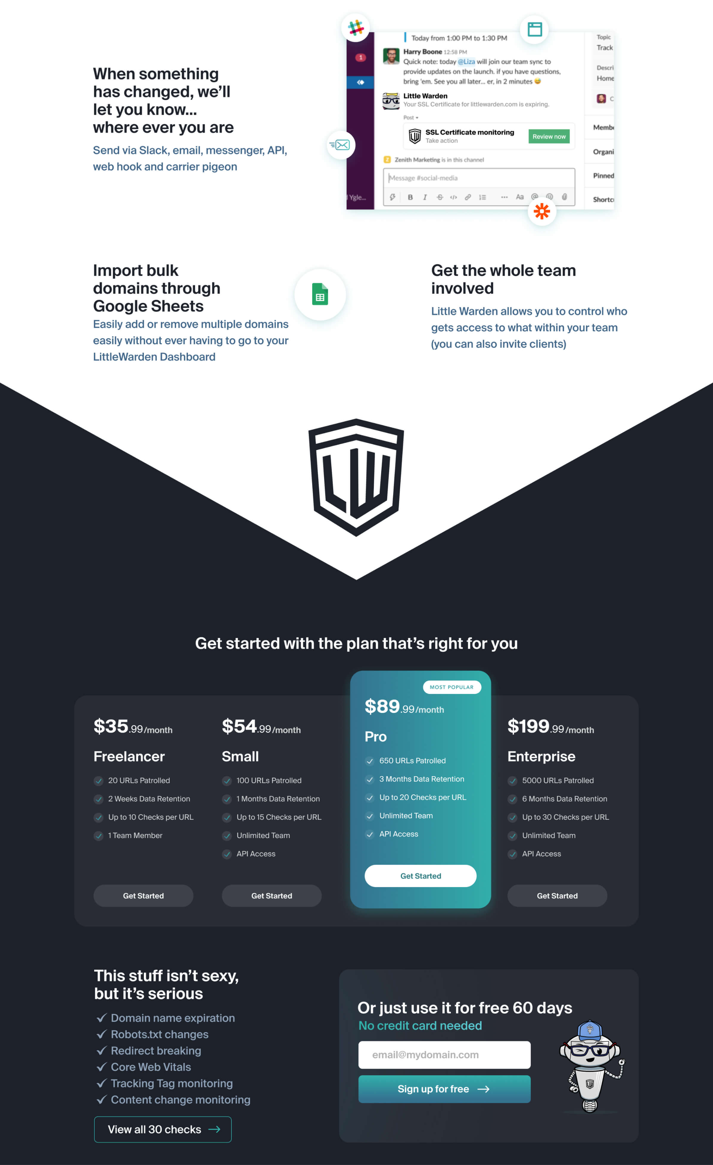
Redesigned the website with a modern aesthetic, with a focus on increasing conversions by better messaging, clear call to actions and targeted glances to the app to highlight certain features and that onboarding shouldn’t take much effort.

browser bar buttons
browser address bar
browser bar buttons
Landing page design for Little Warden part 1 of 3Landing page design for Little Warden part 2 of 3Landing page design for Little Warden part 3 of 3

Going from marketing site to full-blown application refresh

I was initially hired to redesign the marketing site to showcase the features of the Little Warden app.

As the website design progressed, the client saw the potential that the app itself could also benefit from the design and experience overhaul that was being offered in the new website.

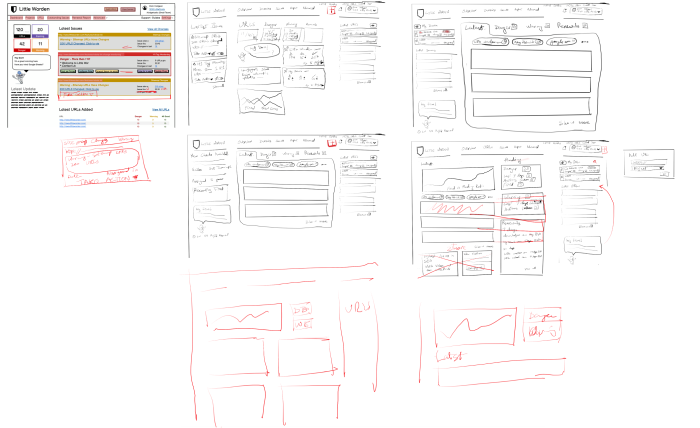
Dom created wireframes to outline the features to be used as a starting point. We went through user feedback over the years and found the weaker links, aligned with the client’s business goals, analyzed the competition and worked towards solutions.

Going from marketing site to full-blown application refresh

Solution to encourage actions and diagnose problems

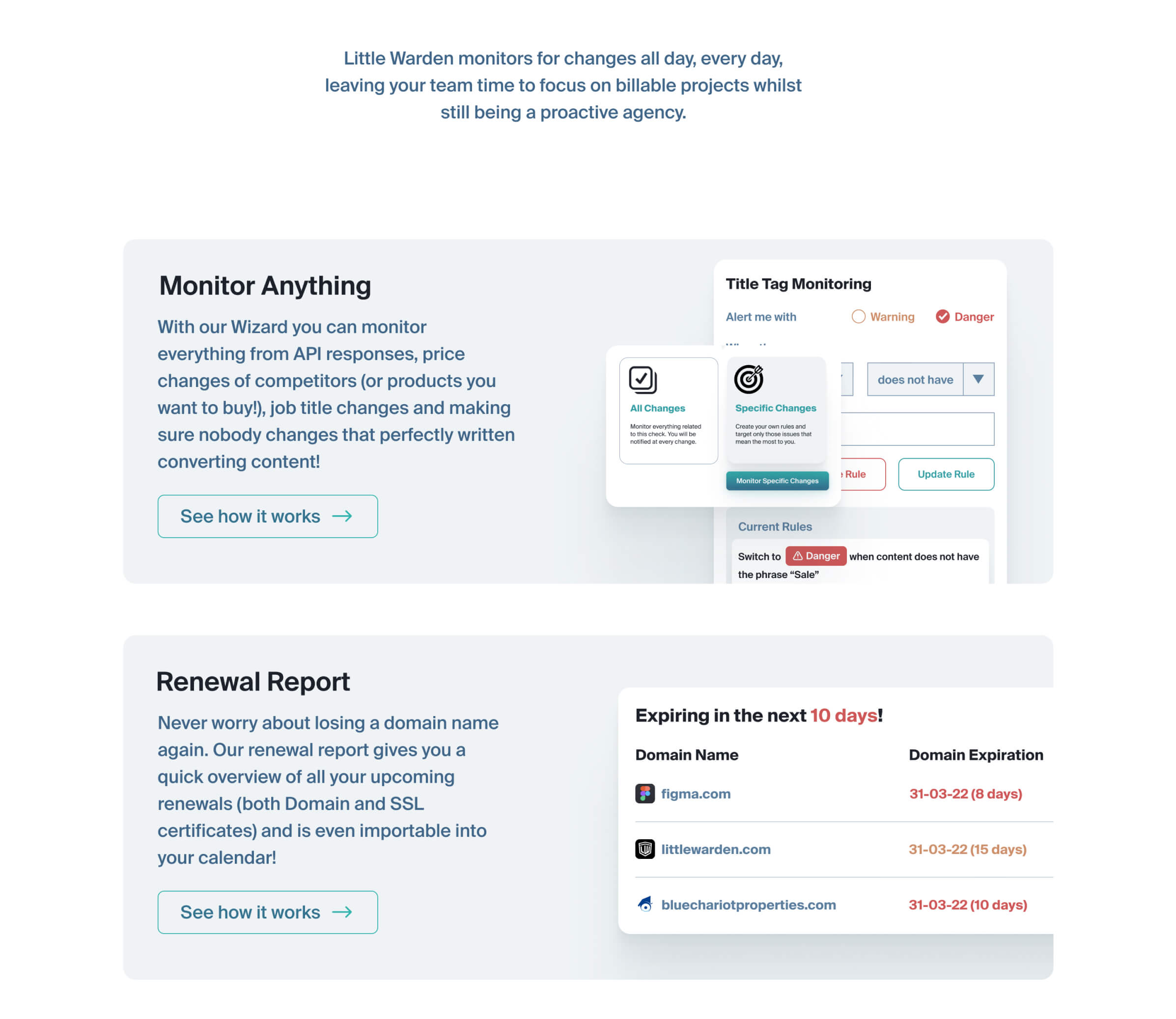
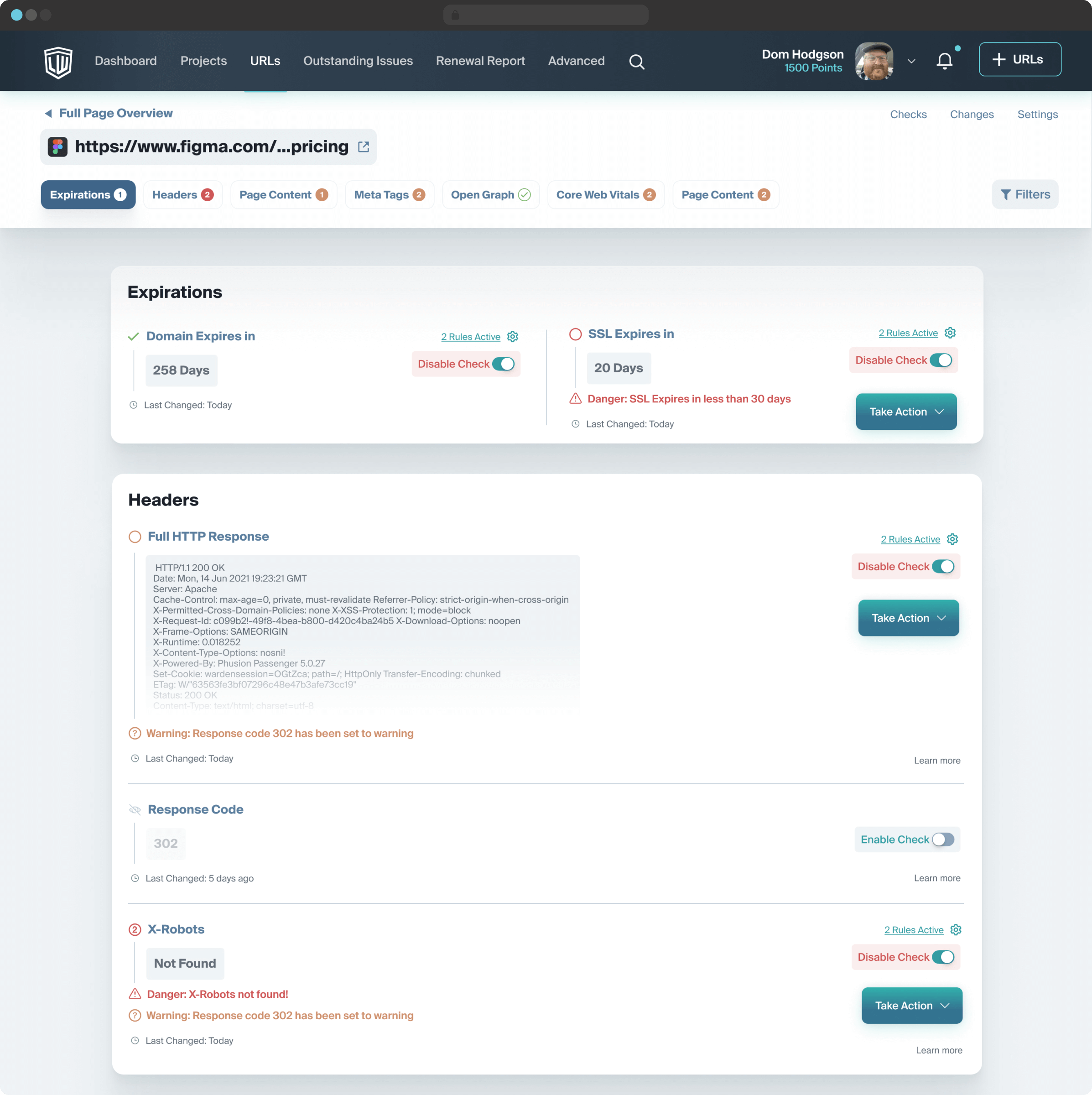
Easy to use interface to allow users to diagnose problems, review changes, configure checks and take actions.

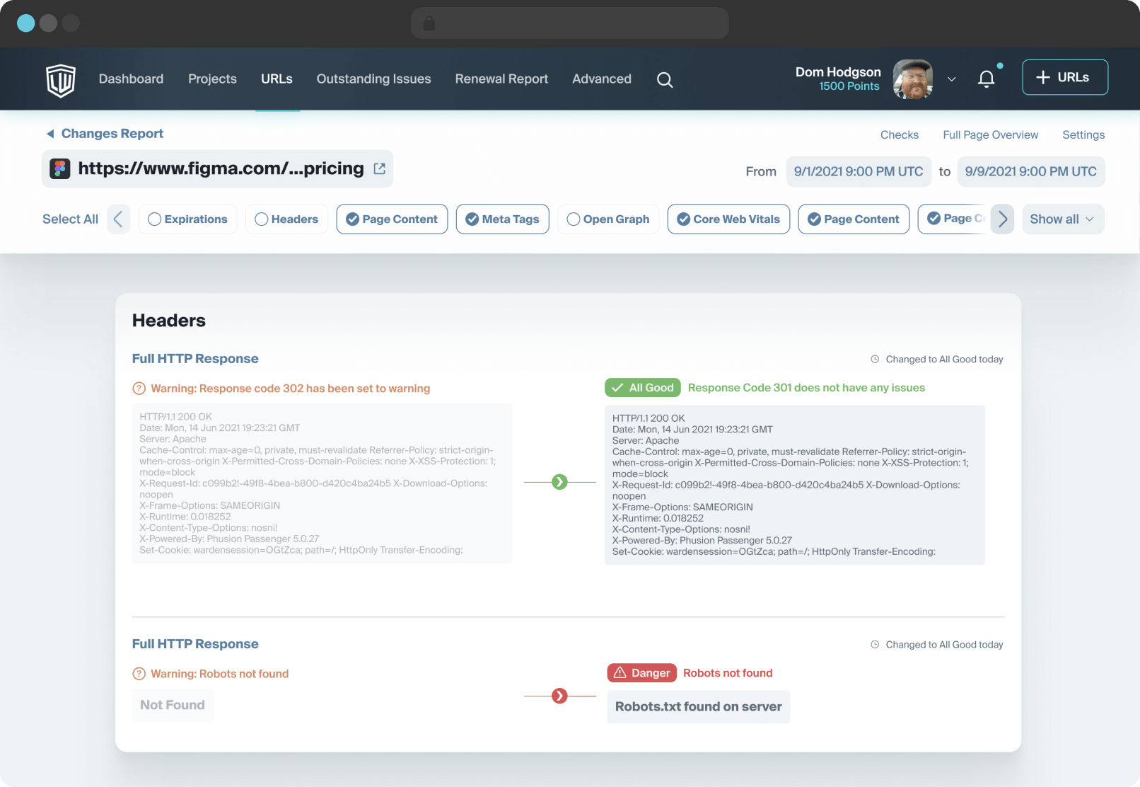
Using a GIT-like interface to compare before and after with additional filter-able options to avoid clutter

Using a GIT-like interface to compare before and after with additional filter-able options to avoid clutter

Easy to use interface to allow users to diagnose problems, review changes, configure checks and take actions

Easy to use interface to allow users to diagnose problems, review changes, configure checks and take actions

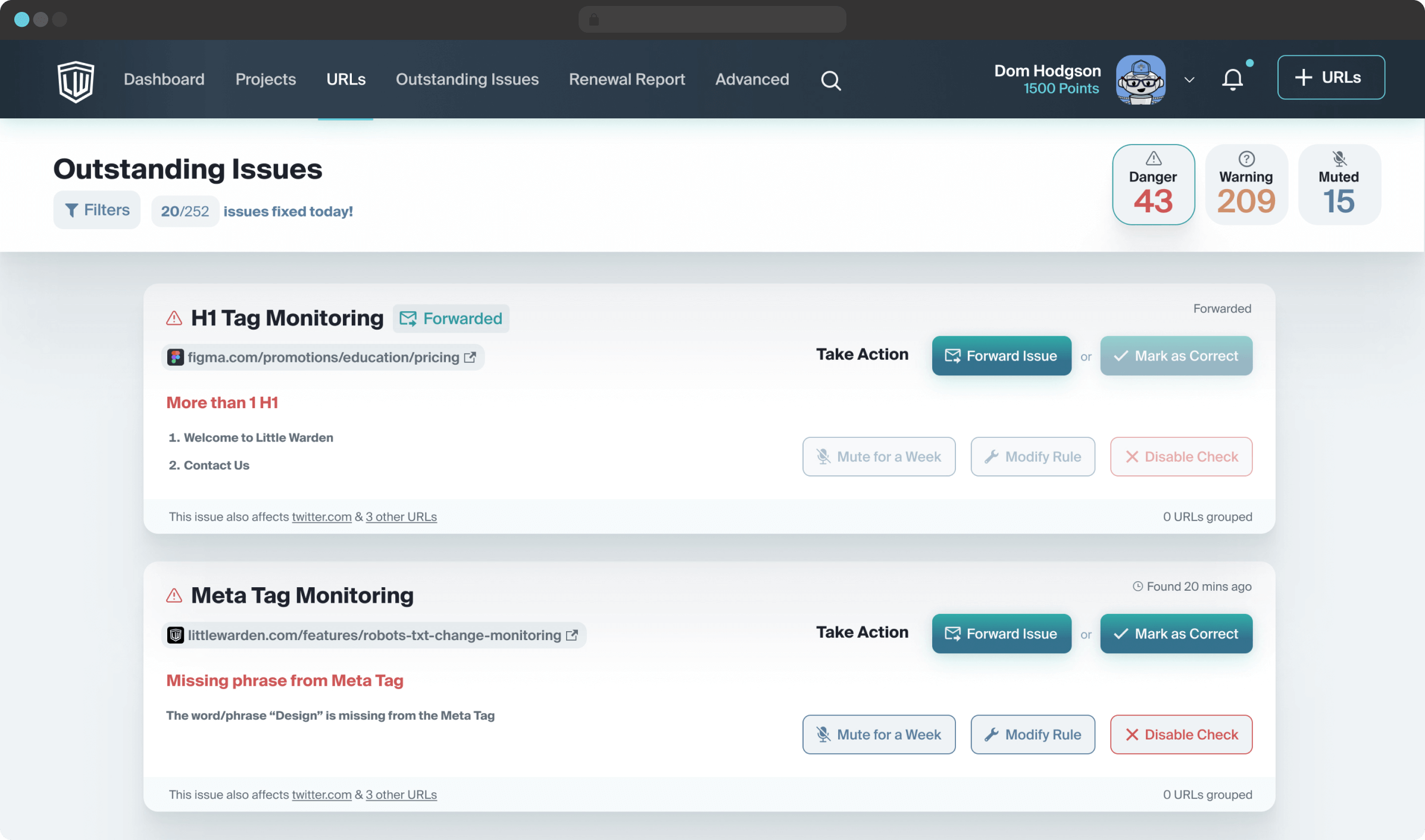
Focused mode to take actions on the errors found

Focused mode to take actions on the errors found

The Challenge

Headers

It was important to maintain consistency with various levels of information needed to be displayed at a glance, yet keeping actionable elements in consistent positions.

Basic version

Basic version

Basic version with a top navigation layer

Basic version with a top navigation layer

Tabbed navigation with action buttons

Tabbed navigation with action buttons

Tabbed navigation with states and action buttons

Tabbed navigation with states and action buttons

Showing URL and scroll-based navigation with error counts

Showing URL and scroll-based navigation with error counts

Showing URL and scroll-based navigation with change counts, along with a dynamic scroll bar and date/time picker

Showing URL and scroll-based navigation with change counts, along with a dynamic scroll bar and date/time picker

Whoops!

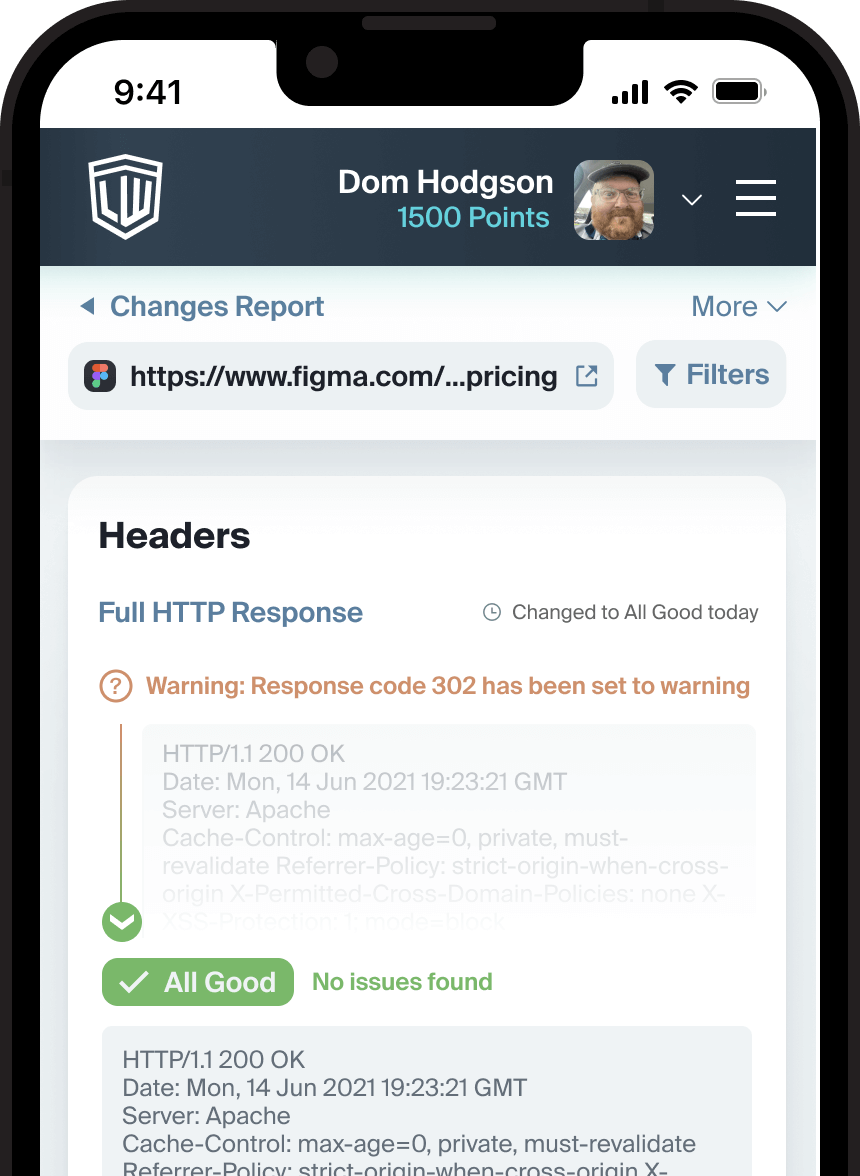
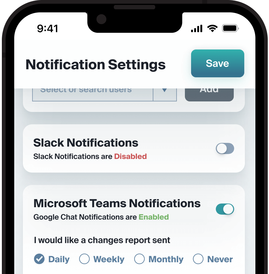
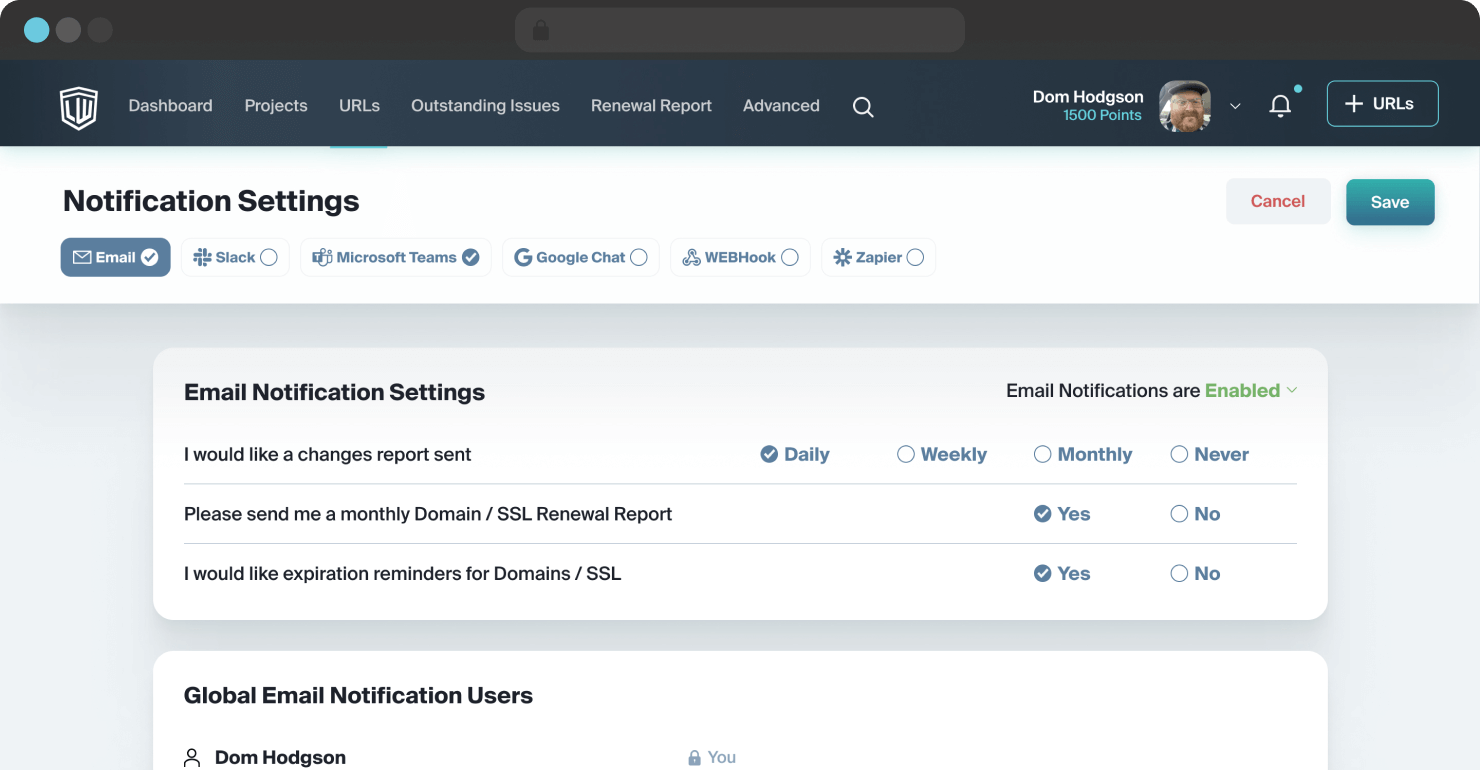
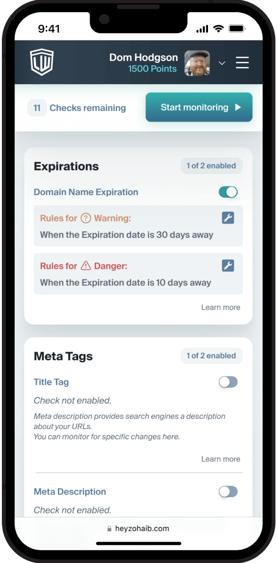
While hiding all the filter elements / tabs from small screens, we were faced with the challenge to either create a parent page for the navigation or show all the content in one go for the Notification Settings page. The first solution wasn’t feasible enough on a technical standpoint, whereas the second would have  required a lot of scrolling with a chance to miss out on important features down below.

Final solution to use toggle switches to only show options for services that were enabled

Final solution to use toggle switches to only show options for services that were enabled

Solution to the long process of adding URLs

Designed the flow of adding URLs, creating, modifying and reviewing checks combining step-by-step processes, templates and wizards.

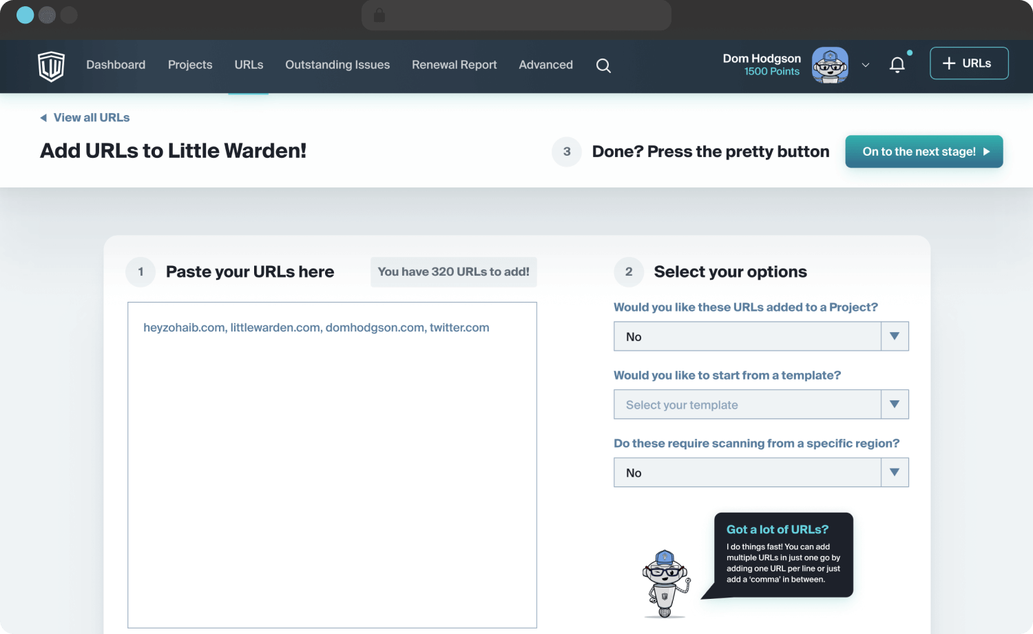
Bulk import URLs

Bulk import URLs

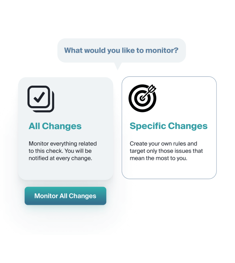
Skip the customization process, if needed

Skip the customization process, if needed

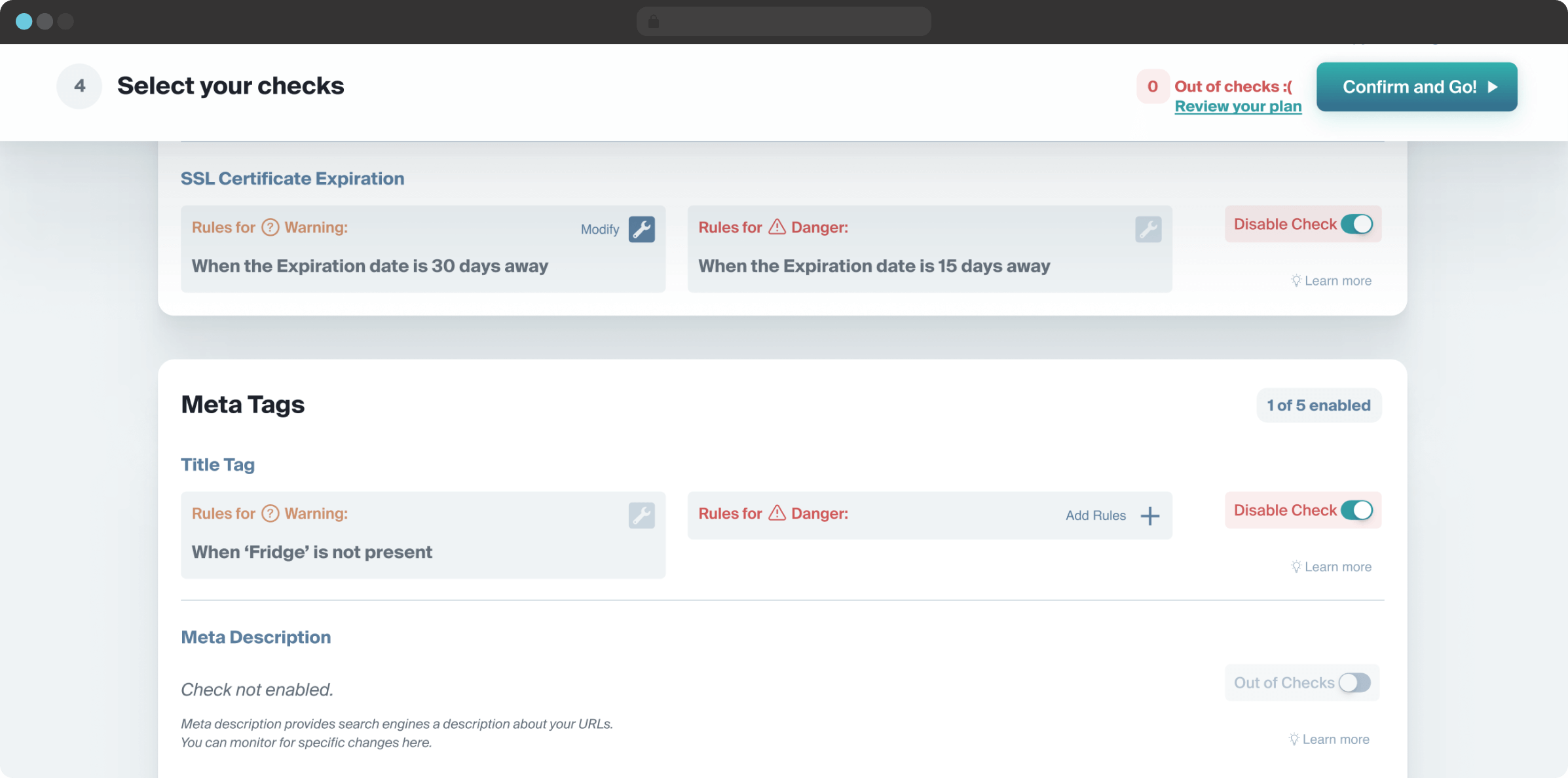
Review, modify or create custom checks across the entire URL with organized actionable information

Review, modify or create custom checks across the entire URL with organized actionable information

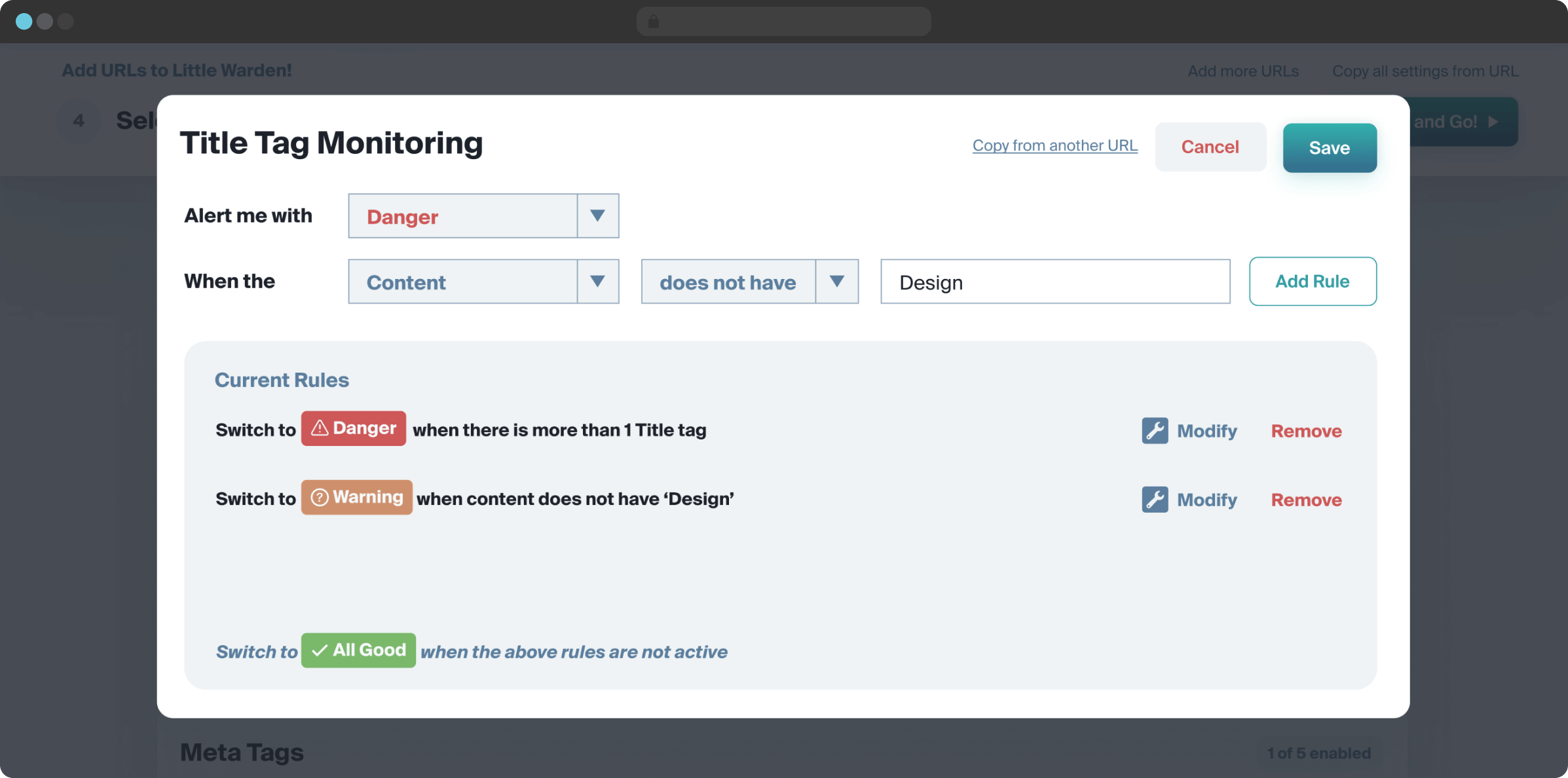
Create or modify custom checks

Create or modify custom checks

I’ve worked with so many companies through my career, big and small, but without a doubt one of the smartest senior/director level UX designers I’ve ever had the privilege to jam with has to be @HeyZohaib. Just incredibly creative!

A MUST hire if the opportunity arises.
Picture of the author of the testimonial
—Dann Petty
Freelance web/app designer,
Author thatportfolio.com,
Co-founder @epicjobs

Are you looking for a senior designer who you can rely on to design a visually stunning and good to use website or app for your business?

To have a quick chat about your project or job post immediately:

Text me at +1 (415) 523 5884 or
DM me on Twitter @HeyZohaib

you can also

Email me at z@heyzohaib.com or
Schedule a discovery call.