Product Designer,
working
remotely
in
US time zone
.

Web Application
UX, Visual Design & Branding
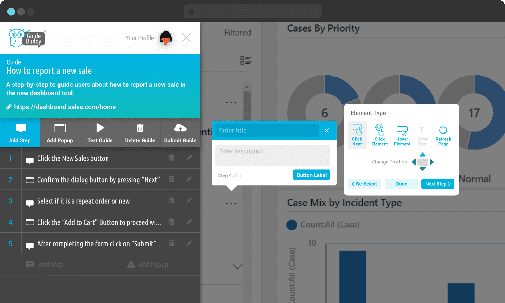
Designing a no-code live guidance platform to build step by step walkthroughs for onboarding and application training.
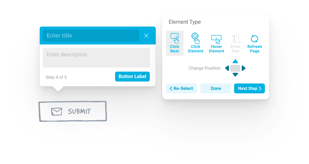
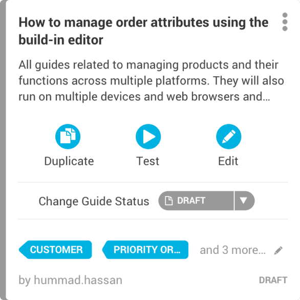
GuideBuddy’s primary aim was to replace or offer an alternative to the common practise of reading help articles or watching videos to learn to use a web application.
While end users preferred to receive the training using live guidance while using an application. However, for someone creating these guides, the process had to be easier than writing an article, guiding someone on a phone call or writing an email explaining the process, so they could use the application more frequently to create guides.

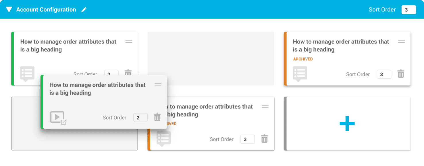
The onboarding features allow for multiple guides to be grouped together in a sequence. Progress is also tracked marking the sections as completed to be continued or revisited later.
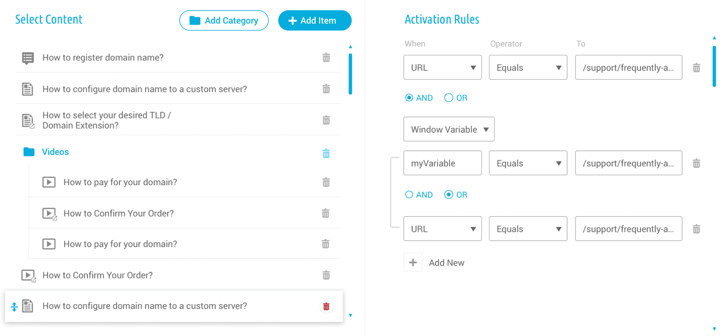
When inside such a section, a combination of guides, articles or videos can be used to accommodate the application onboarding or feature training process.
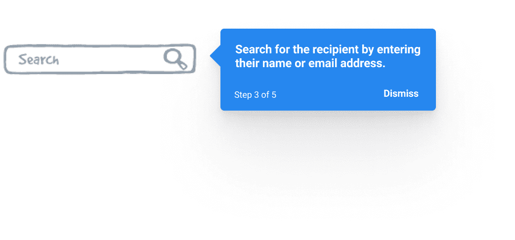
Instead of defaulting to live chat or knowledgebase articles, users can trigger the GuideBuddy widget to get step-by-step guides. The list of available guides can be contextual through segmentation settings, including where they are on the website/application.
With the search feature, users also get a quick shortcut to start a live chat if they are unable to find their guide.
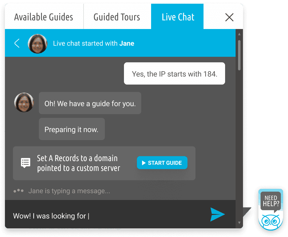
Instead of live chat agents pointing users to where to find the information they are looking for, which often involves mentioning the name and location of a button, the support agents can save both their time and the customers’ by linking a guide which a user can start to perform their tasks independently.
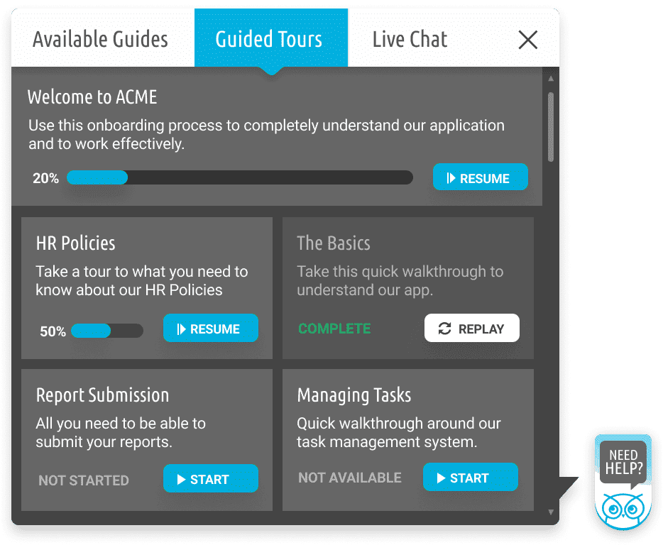
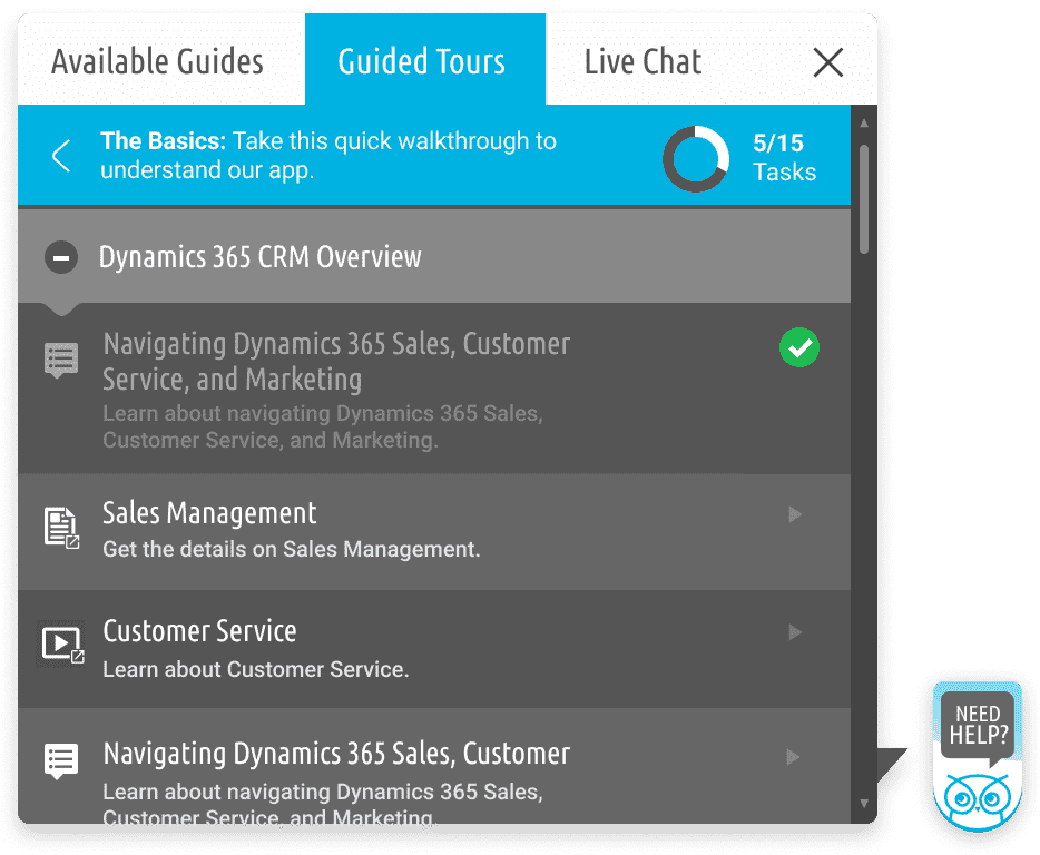
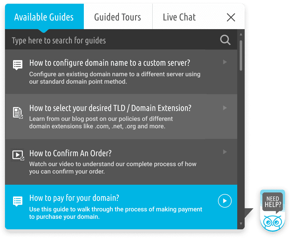
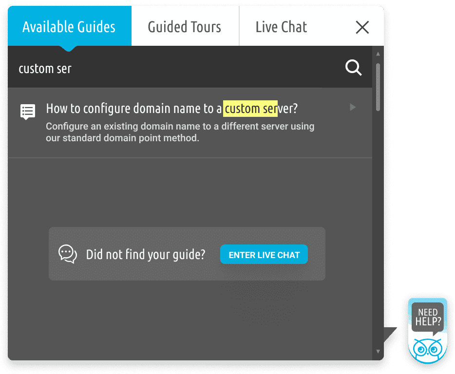
A proof of concept to test feasibility for development had already been created. The team was excited to move further and I was added to the team as the only designer to design the UI of the already built application as a 3-month freelance agreement.
Trying to catch up with the development speed was creating inconsistencies with the design and the user experience was suffering because of lack of research and testing.
I was able to convince the team to allow design to take a step back and view the product from a bird's eye view and strategize accordingly. This included from going deeper into the target audience with user personas to the overall product vision. From a screen-to-screen design approach originally anticipated by team, it went to a holistic view of the application where experience mattered more than the number of screens.
Adding more controls to the header harder to navigate and inconsistent that started with a single row. With a different set of controls on each page and not enough room to add labels, we started adding tooltips as possible solutions but it was only a workaround. We needed a change.

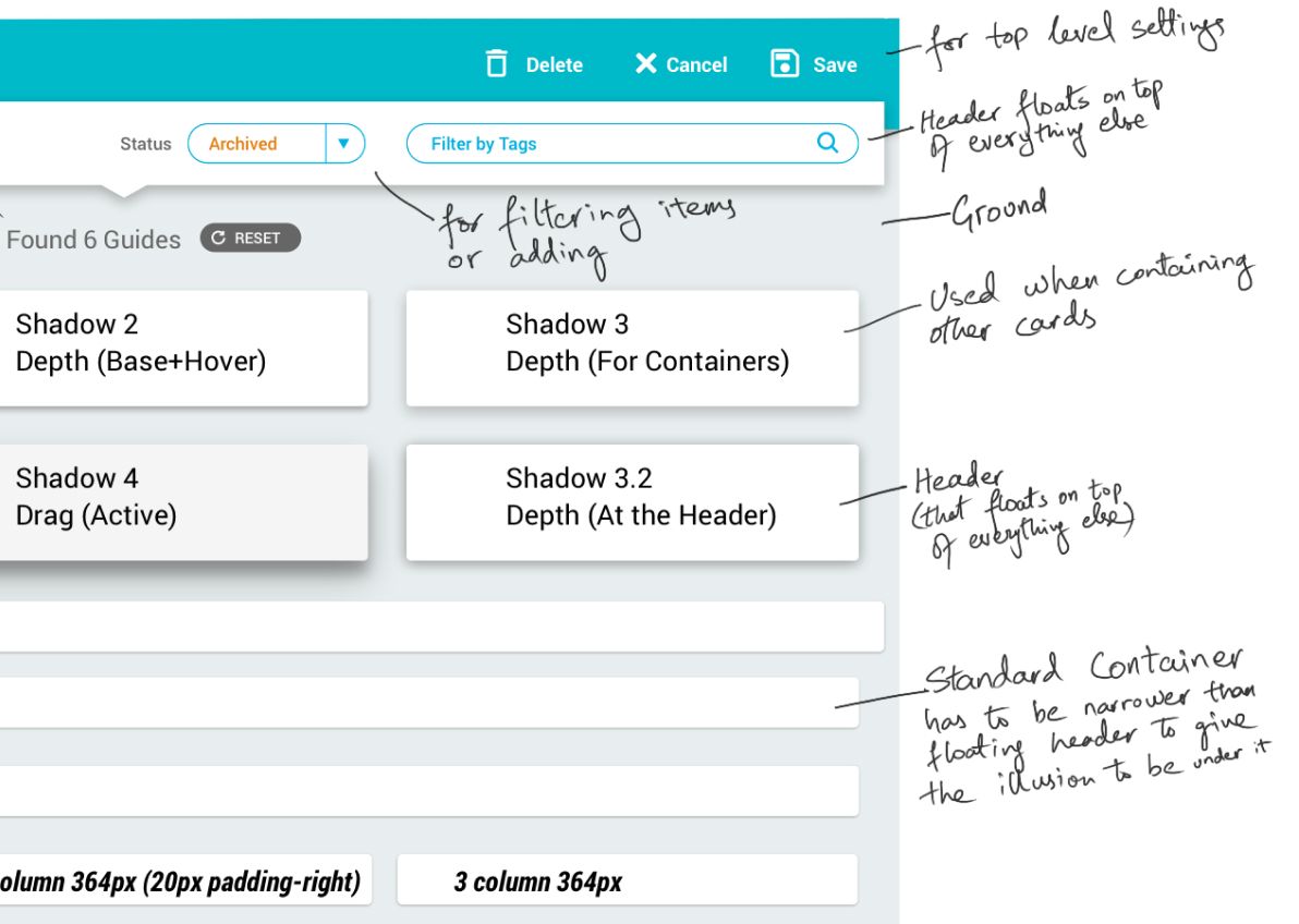
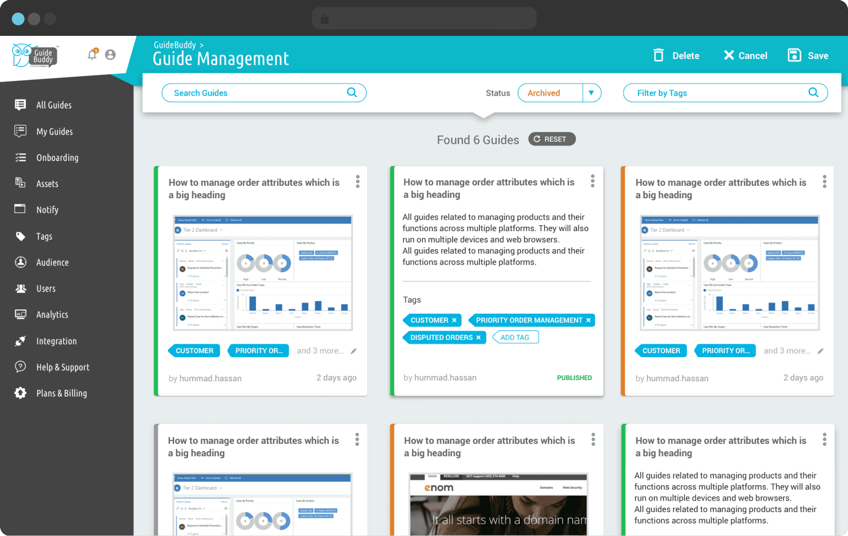
After various iterations, we agreed to divide the header into two levels. The top bar to only have top level settings, normally reserved for actions needed to be used only once per interaction. A new floating bar was added to filter or add items that would directly reflect to what was displayed below.
This required a depth hierarchy to be made a part of the design system. It was inspired by Google’s Material Design to make the floating appear above the other layers.
With the design system in place, it became easy to focus on user experience, and for the developers to also not have to rethink design implementation every time a new layout was created.

Designers like Zohaib are a rare find. Over the years of working even with senior designers from North America, I have never met someone with such a deep understanding of UX and product design. Zohaib is very easy to work with and he adds value not just for design but across the spectrum, from design to strategy, content and marketing. During our product demos and investor presentations, I received a lot of positive feedback because of the design alone because of him.

I am currently based in Lahore, Pakistan.
For compliance purposes, I have a business entity registered in United States which can be used for direct bank transfers and contracts, where needed. I also accept payments in crypto.
Yes, all of them. I get to live my childhood dream of staying up all night, and as a result, it allows me to work and collaborate during 9-5 US East and West Coast hours.
I prefer weekly, monthly retainer. If the scope is well defined, then I'm flexible to work with a value-based fixed priced model as well.
Yes. I have led several teams, hired and mentored designers, including those outside of my primary discipline. I’ve also had the privilege to work under some exceptional leaders. I can join your Slack or other collaboration tools so your team doesn’t have to make any adjustments to get me onboard.
I love building products from the ground up. Working with product owners, co-founders and senior engineering early-on allows me to understand the roadmap and business goals. This allows design with better decisions to prioritize features, design and prototype them, and get them shipped, while keeping the business goals a priority. I work across the entire product design spectrum, and can jump in wherever needed to ensure your project is a success.
Yes. I am also a certified Webflow developer. In most projects I take help or outsource to dedicated front-end developers. I jump into browser tools very frequently to fix any last-minute bugs instead of going back-and-forth from Figma to the development team.
Consider the cost you can save by hiring a designer who can easily jump to production and the final deliverable, instead of a static design file or animated prototypes, will be a fully functional website.
PS: I developed this website, with all the fancy interactions and WebGL (threejs) stuff myself.
You can also download my resume or
share it with your colleagues.
I’ve worked with so many companies through my career, big and small, but without a doubt one of the smartest senior/director level UX designers I’ve ever had the privilege to jam with has to be @HeyZohaib. Just incredibly creative!
A MUST hire if the opportunity arises.
Designers like Zohaib are a rare find. Over the years of working even with senior designers from North America, I have never met someone with such a deep understanding of UX and product design. Zohaib is very easy to work with and he adds value not just for design but across the spectrum, from design to strategy, content and marketing. During our product demos and investor presentations, I received a lot of positive feedback because of the design alone because of him.
"Coming from a bootstrapped tech company, we were not able to invest much in design. When we were taking SoloInsight to United States, we knew we had to pay very close attention to the UX of all of our applications moving forward. Hiring Zohaib was a no-brainer. He was our first proper design hire that laid the foundations to the design team at SoloInsight. We were under extreme pressure to give product demos to our investors and customers where Zohaib masterfully took my vision forward, worked with the development teams and consolidated our applications to smaller units. He set the tone for our design language that we use to this day."
"Zohaib's talents rival -and surpass- many of the “expert” designers we have contracted with in the past throughout the world. His experience level is quite sophisticated, original and creative, and I find his world-view, relating to client technologies and capabilities to be astounding for a man of so few years. He is also quite a pleasant young man to work with, never complaining, and eager to handle whatever we throw at him. He always shines when under extreme pressure, and has never yet disappointed us or our clients in meeting deadlines and project expectations.
Text me at +1 (415) 523 5884 or
DM me on Twitter @HeyZohaib
Email me at z@heyzohaib.com or
Schedule a discovery call.